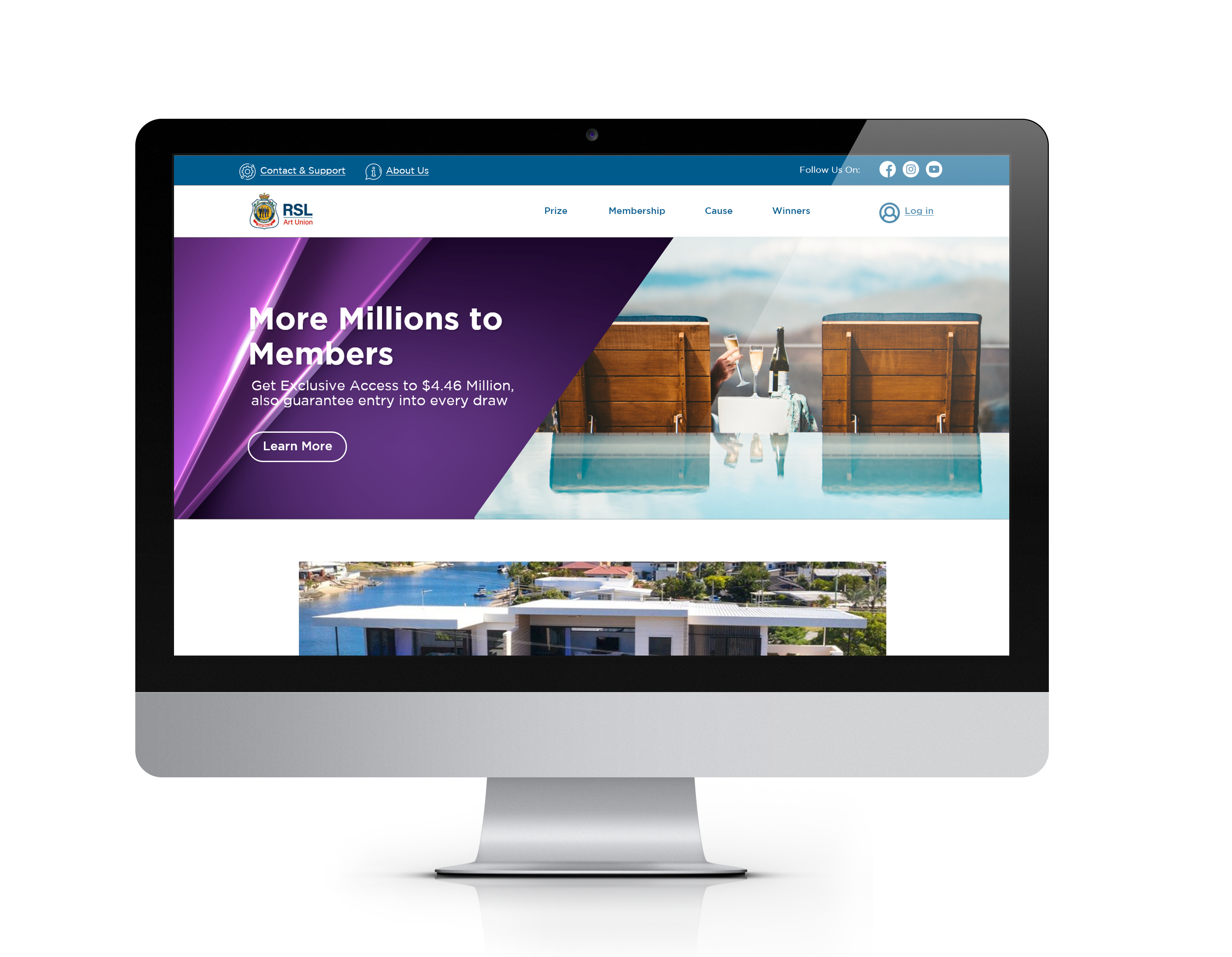
Redesigning RSL(Returned and Services League) Art Union Website is a case study of my design process for my project at Peak XD. It describes the steps involved in the landing page redesign, including information architecture, heuristic evaluation, card-sorting, tree-testing etc.
My UX Design Process

Overview
THE CHALLENGE
Most of the processes had to be completed remotely with accommodating time differences and social distancing with the research participants.
THE PROBLEM
RSL Art Union’s values didn't communicate effectively with the users on the website. Also, the path to join the VIP Club from a single ticket purchase path was not seamless. These two main problems could increase drop-offs throughout the single ticket purchase as well as VIP Club sign-ups.
GOALS
The primary goal was to offer customers a seamless and easy to use purchase path whether they are purchasing a single ticket or joining the VIP Club. The purpose of this helps to increase VIP sign-ups without making the path obstructive to single ticket book sales. The new user experience also had to provide a sense of fulfillment when customers purchased a single ticket or joined the VIP Club.
Research
My intention for the research phase was to uncover the needs and frustrations of the target user to better understand how to appeal to them.
RESEARCH GOALS:
1. Define users’ motivations, goals, and frustrations when purchasing home prize lottery tickets while browsing the website.
2. Understand what makes a user’s ticket purchasing experience satisfying.
3. Identify areas of improvement for the RSL Art Union website.
SECONDARY RESEARCH - MARKET RESEARCH
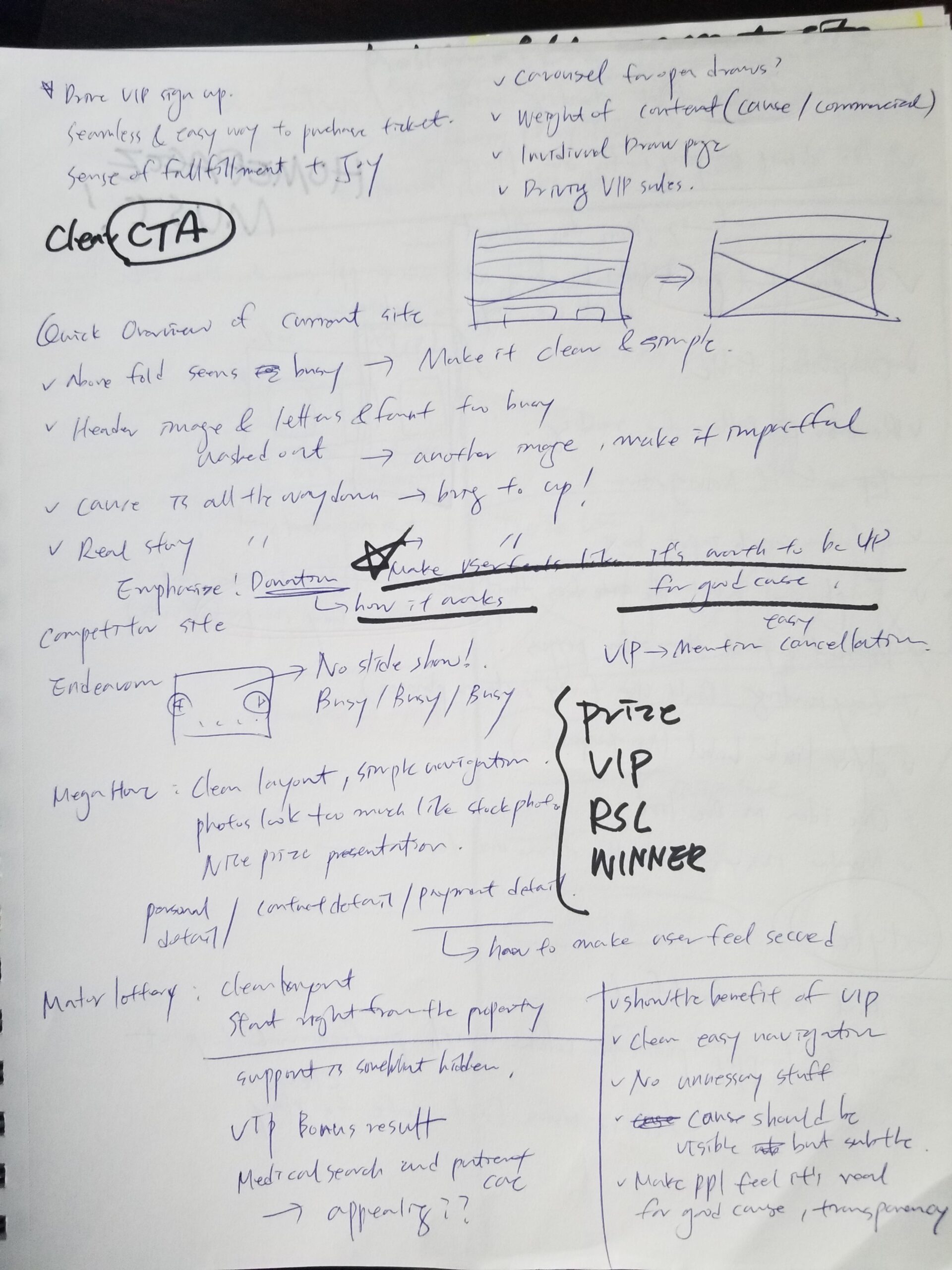
First, I conducted secondary research to familiarize myself with the RSL Art Union and RSL Queensland. I collected information from their website, articles, and posts on their social media platforms to understand the brand of the organization, their value proposition so that I can incorporate them into the UX redesign.
SECONDARY RESEARCH - COMPETITIVE ANALYSIS
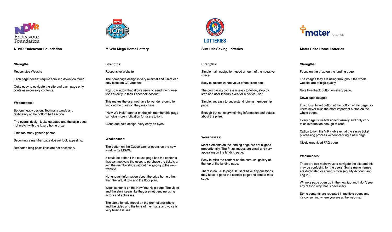
To build off my secondary research, I analyzed some of RSL Art Union's competitors in luxury home prize lotteries. I uncovered the strengths and weaknesses of Endeavour Foundation lotteries, Mega Home lottery, Surf Life Saving lotteries, and Mater Prize Home lottery which are possible competitors of RSL Art Union.
PRIMARY RESEARCH 01 - USER INTERVIEW
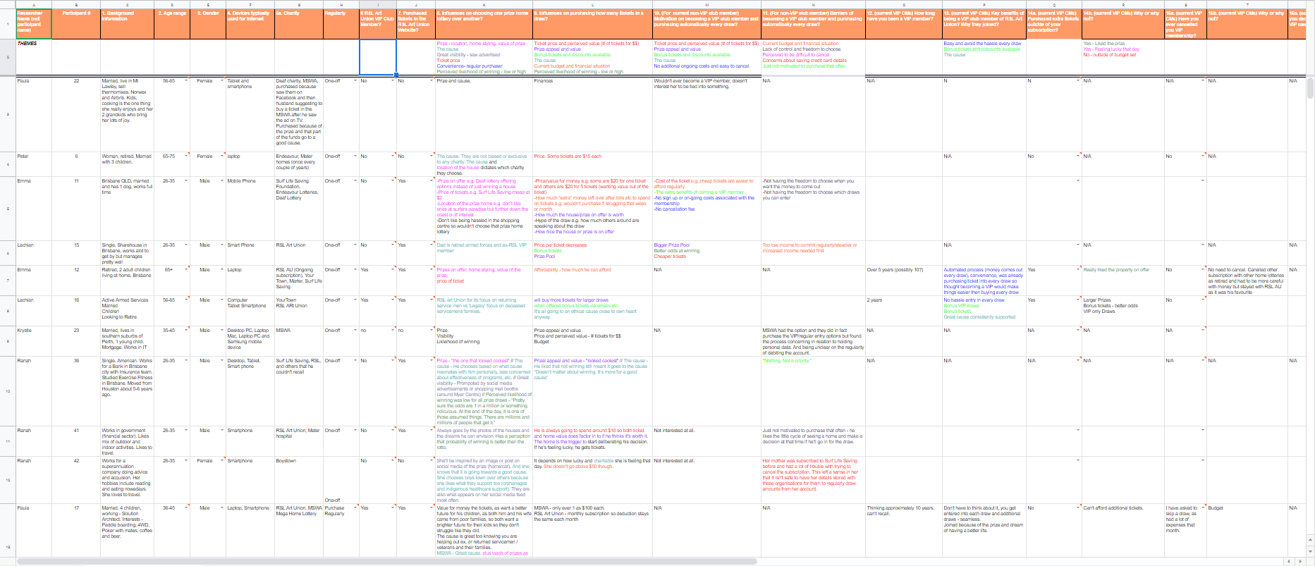
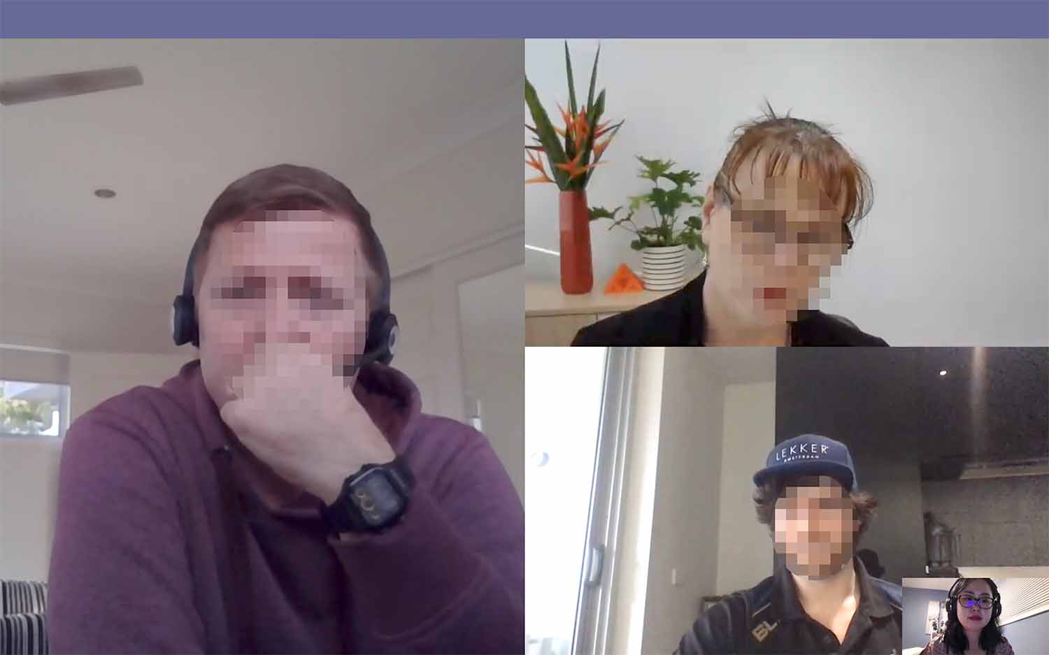
Empathizing with the target audience and collecting qualitative data is a crucial step in the design thinking process, so it was essential to interact with real customers. Because of the locational restriction (the majority of the users live in Australia), I had a few Zoom meetings. One was with a VIP member and I asked about his motivation to become a member, any needs and frustrations while using the website.
After completing the interviews I wrote down all of the responses on a note, clustered them based on topic with answers from interviews conducted by other students. Clustering interview responses allowed me to discover trends and patterns from which insights could be constructed. Through this process I identified several user needs:
- Users need to know more information about VIP membership from the landing page.
- Users need to have an option to pause the membership subscription on the website.
- Users need to engage more with their cause as a VIP member.
- Users need to see a unique identity and the cause of RSL Art Union.
- Users need to know where they can find what they're looking for on the RSL Art Union website.
PRIMARY RESEARCH 02- HEURISTIC EVALUATION
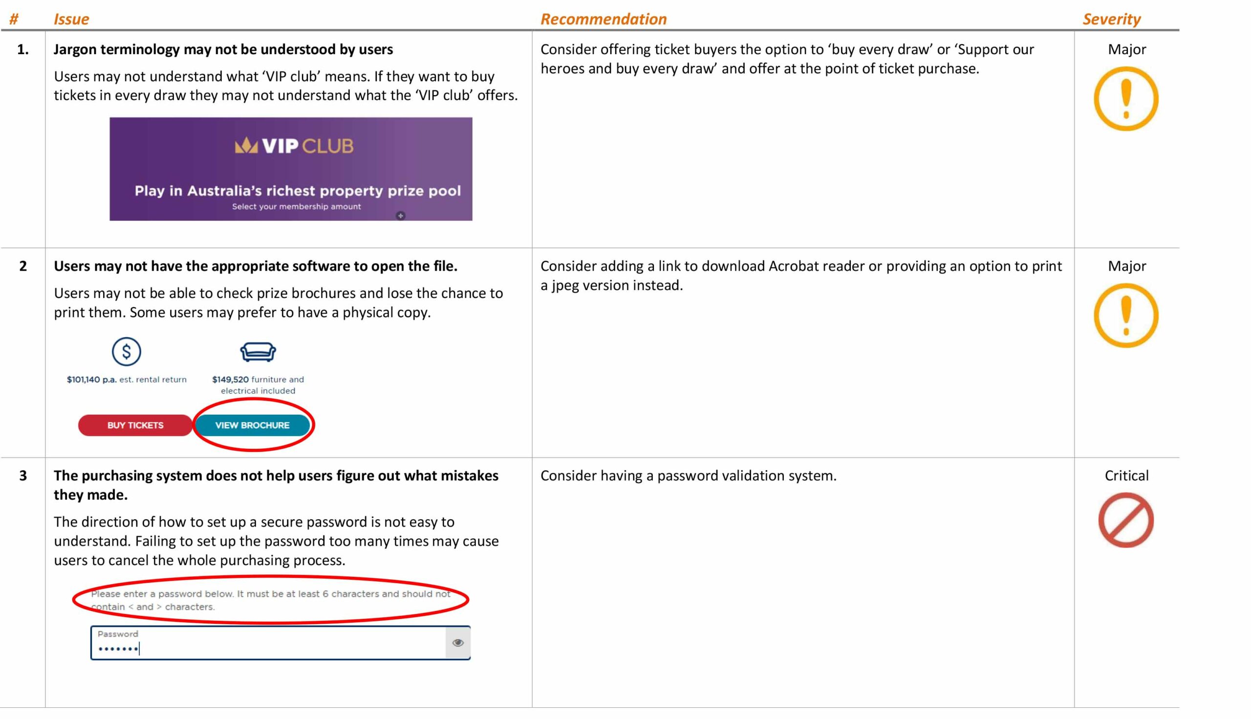
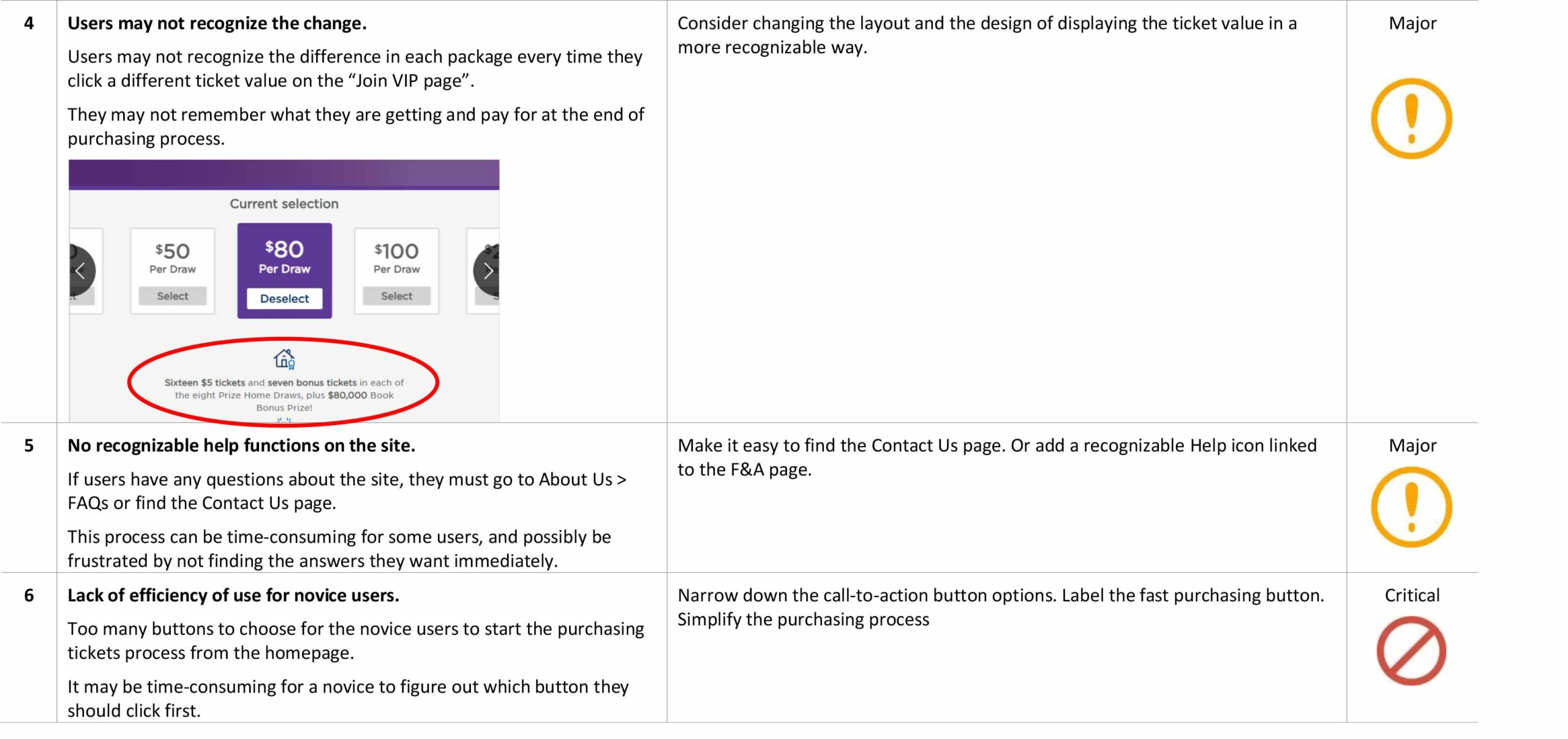
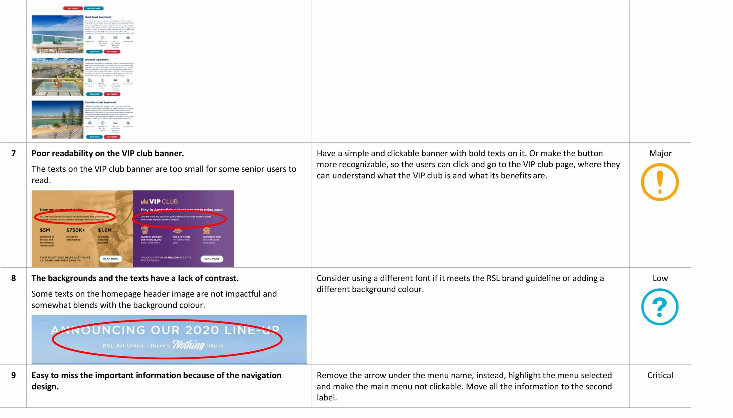
The last step of the research includes a heuristic evaluation of the current website using Jakob Nielsen’s 10 Usability Heuristics for User Interface Design. For example, when novice users visit the website for the first time, they can be overwhelmed by long scrolling down and the number of Call to Action buttons. This can be classified as a problem with ‘flexibility and efficiency of use.’ Empathizing with the target audience and collecting qualitative data is a crucial step in the design thinking process, so it was essential to interact with real customers. Because of the locational restriction (the majority of the users live in Australia), I had a few Zoom meetings. One was with a VIP member and I asked about his motivation to become a member, any needs and frustrations while using the website.
After completing the interviews I wrote down all of the responses on a note, clustered them based on topic with answers from interviews conducted by other students. Clustering interview responses allowed me to discover trends and patterns from which insights could be constructed. Through this process I identified several user needs:
PERSONA CREATION
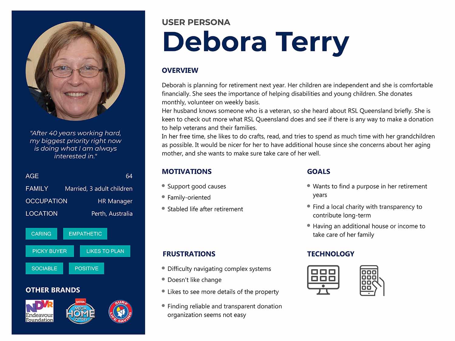
Next, I used all of the qualitative data I gathered during the research process to create my user persona. Debora and Howard. Debora is 64 years old, a married woman who is planning for retirement next year. Her biggest priority right now is doing what she is interested in. She sees the importance of helping disabled people and young children. She donates monthly, volunteers on a weekly basis.
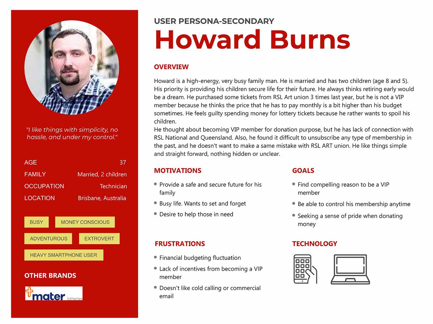
I also created a secondary persona to meet the goal of the client to expand the target audience range to the younger demographics. Howard is a high-energy, very busy family man. He thought about becoming a VIP member for donation purposes, but he has a lack of connection with RSL National and Queensland. He likes things simple and straightforward, nothing hidden or unclear.
Define & Ideate
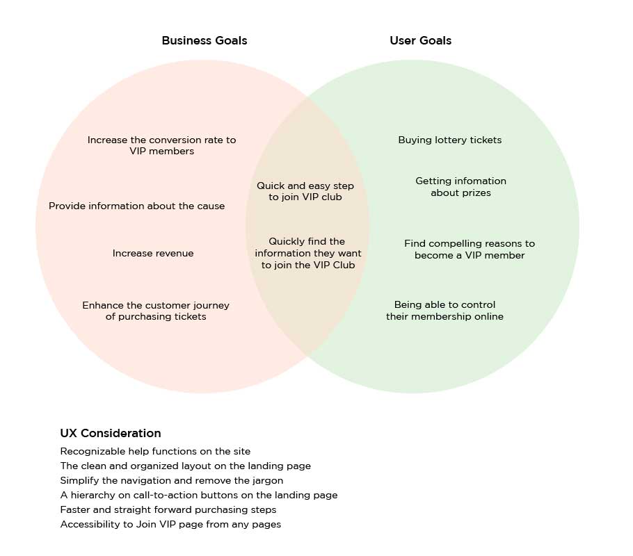
Now that I had empathized with target users and identified their goals and needs, I needed to define the solution. I reflected on the business goals, user goals, and UX considerations to find a happy medium for all stakeholders. Once I had identified common goals, I could decide what product features were necessary for the prototype.
Information Architect
CARD SORTING
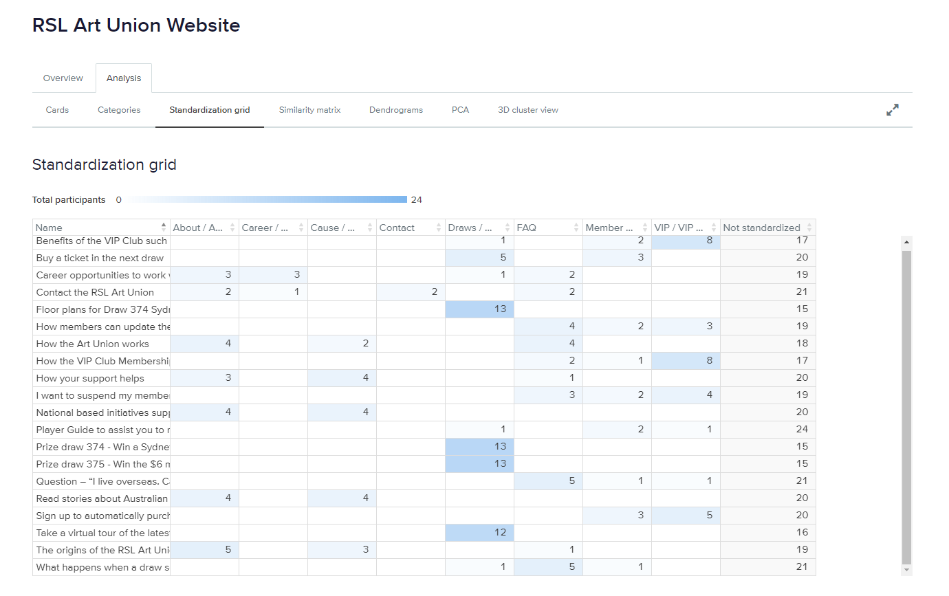
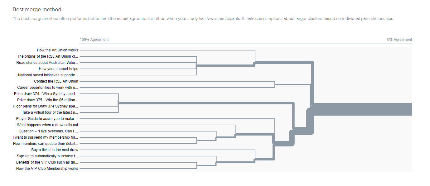
To determine the structure of the new website, I and other students conducted a series of opened card-sorting with Optimal Workshop’s Optimal Sort. The series of tests helped me to understand how users group information. A majority of the tests were conducted online during the Pandemic, but I also did 1:1 and face-to-face tests with a few of my acquaintances. This allowed me to observe the participants and conduct a post-test interview.
Findings:
I made the assumption that users need to navigate About Us and Cause page from the main navigation, however, participants' feedback revealed they think both pages contain almost the same information. Participants also tended to click the FAQ page without too much hesitation if it takes a little longer to complete tasks. Finally, participants expected to be able to find the contacting route on any pages of the website although there was a card labelled as “Contact”.
Design Solutions
INTERACTION DESIGN
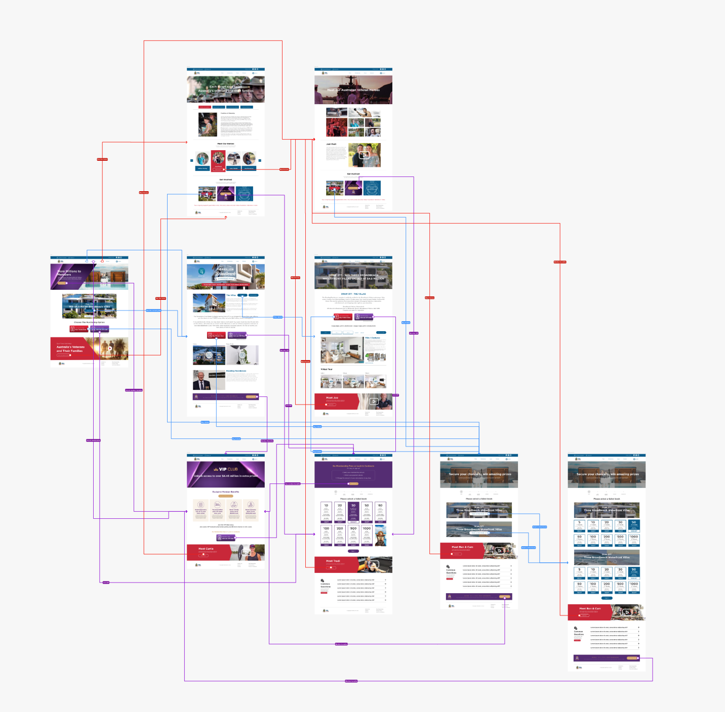
I completed a task flow and user flow to imagine the ways a user might navigate through the site to achieve their goals. These tools allowed me to ensure that the information was organized in a way that is intuitive to the user.
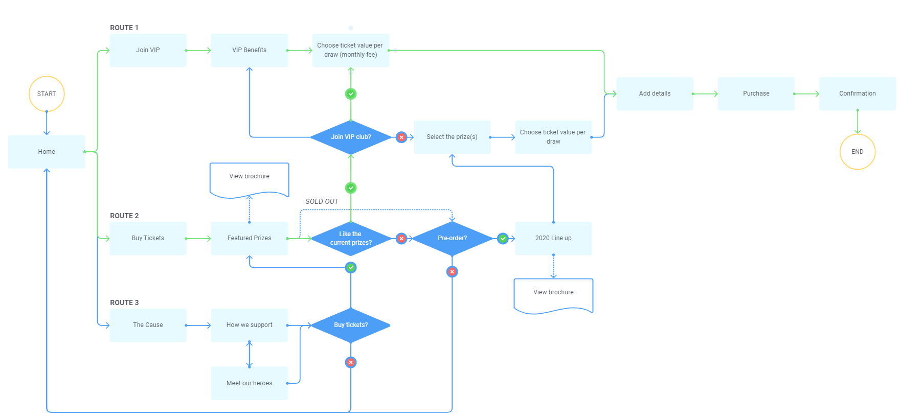
SKETCHING & WIREFRAMING
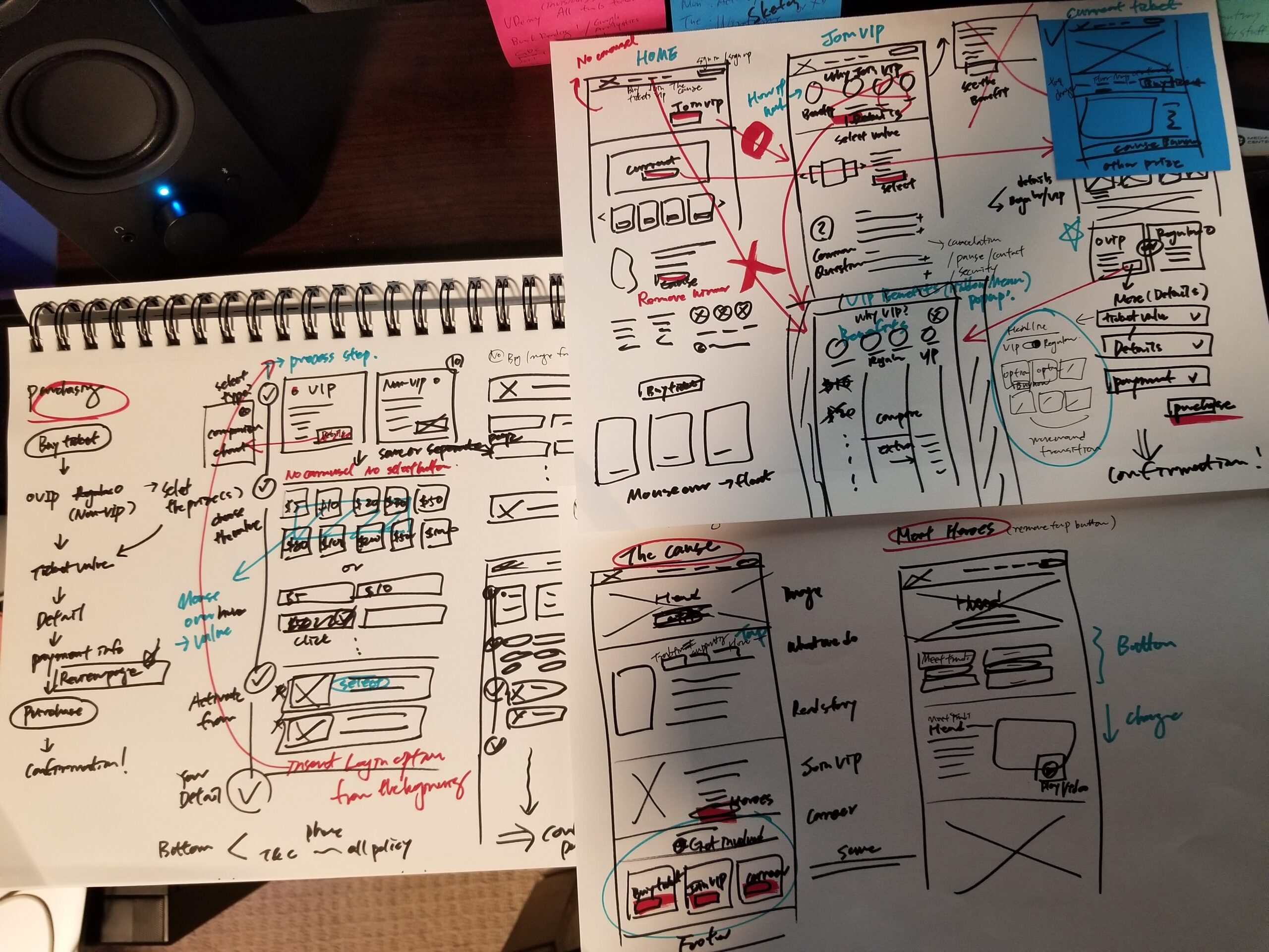
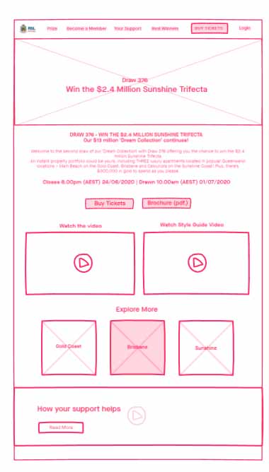
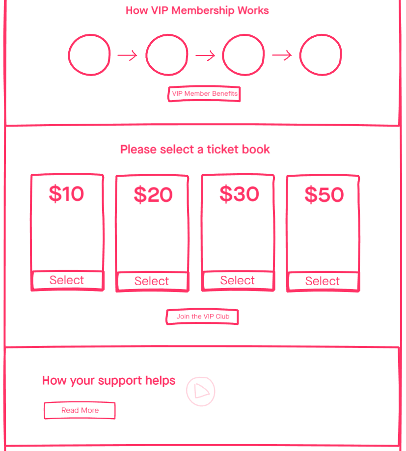
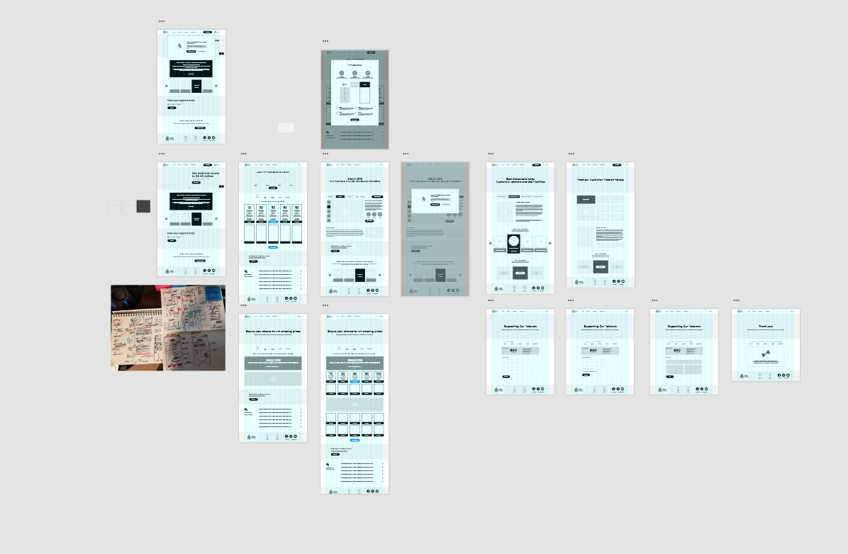
I began the process of wireframing with hand sketches of variations of the website landing page. During this process, I thought about how the layout and content could be structured to satisfy user and business goals in a technically feasible way. The sketch I chose served as a guide for my digital wireframes. After I decided the first draft of the landing page layout, I created low-fidelity digital wireframes using Invision and I used them for the Chalk mark test before creating high-fidelity wireframes to save time.
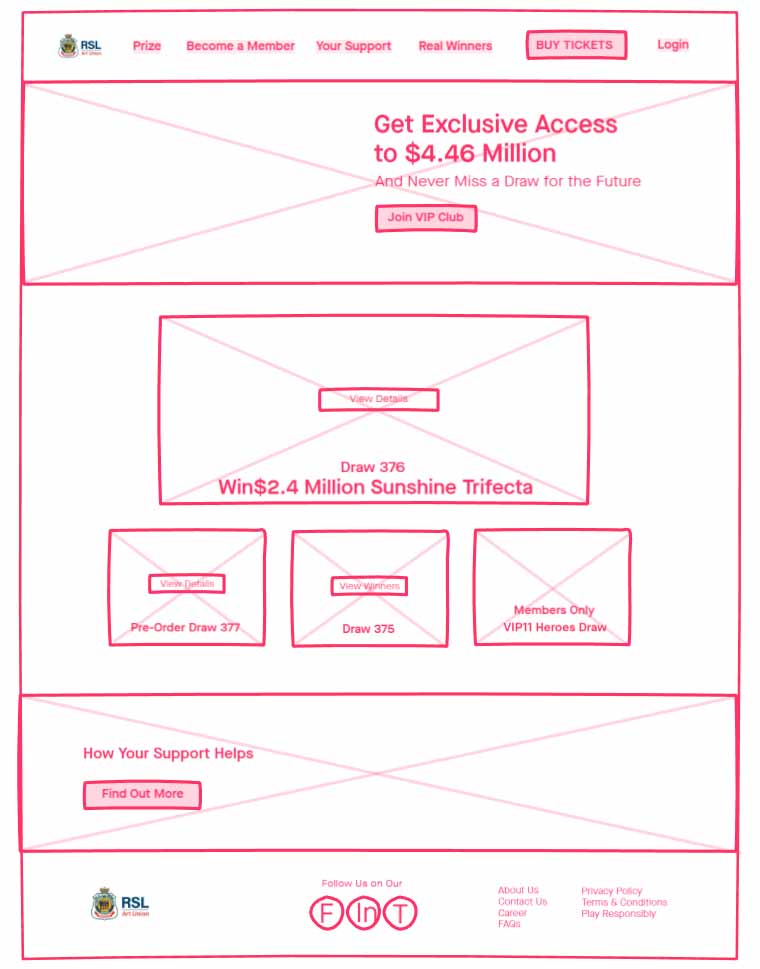
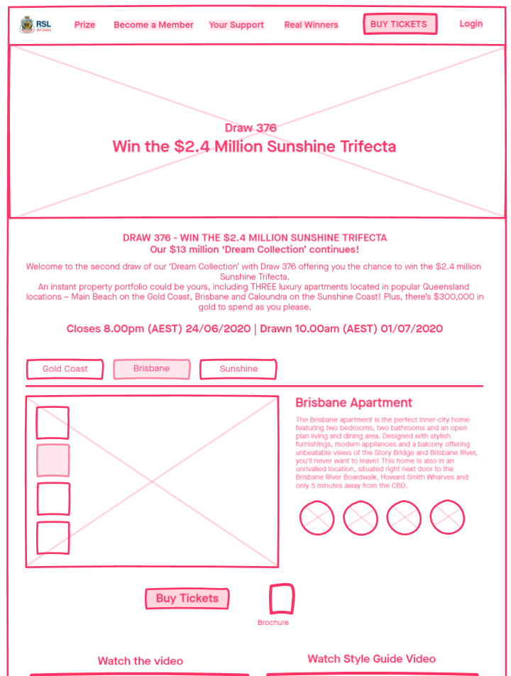
Usability Testing
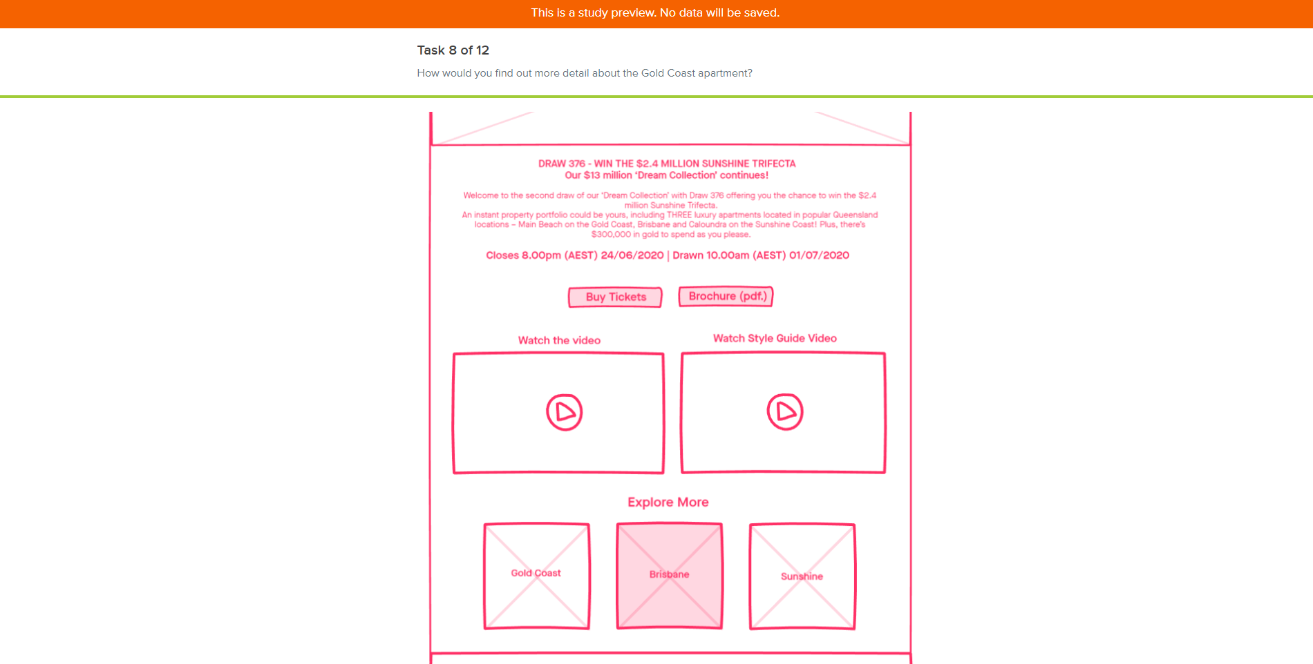
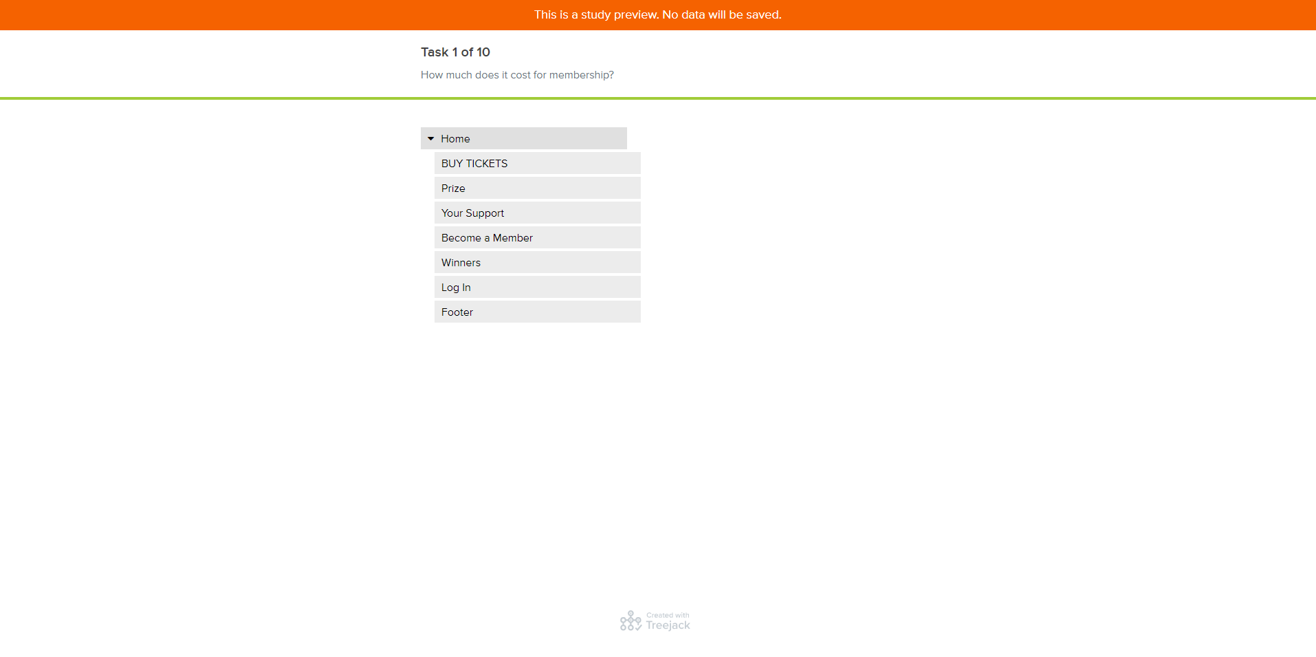
I asked 3 participants to test out the usability of the website by conducting a Tree test and Chalk mark test to identify any problems associated with the usability of a system. 2 participants completed the usability test in person and 1 did remotely via Skype.
The objectives:
To determine whether or not
- Navigation and information architecture are easy for users to use and they can successfully use them to find information.
- The new proposed design provides users a more seamless experience to purchase tickets and sign up for VIP membership.
- The new proposed UX design helps users to build more trust and understanding what RSL Art Union is (Build positive and memorable
brand experience).
Participants completed the task with over 90% success rate, and here are few findings after the usability test.
Findings:
- Participants seemed not to understand what “Your Support” is at the main navigation and missed clicking it to find the cause which is the main motivation for users to join the VIP club. The solution is to label the menu name as “The Cause”.
- Participants tended to scroll down the landing page fast and miss a few important Call to Action buttons. The solution is to keep the high
priority contents on the above the fold area.
- Participants found it difficult to find where they can pause their membership subscription. The solution is specifying the pausing subscription option under the Join VIP banner or button at the homepage.
Mid-Fidelity Wireframes
I created a low-fidelity prototype of the desktop site in Adobe XD. I kept everything in black and white, so I can easily change the layout before adding any photos and colours. This gave me more flexibility to experience different layouts and the interactions between pages.
Interactive Prototype
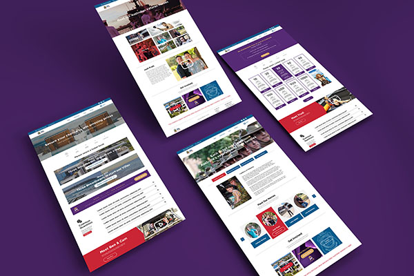
After several iterations of my mid-fidelity prototype, I fleshed out the details of each page with images, typography, interactive links, etc. The project was completed with Adobe XD.
Project Reflection
I delivered a 30 minutes online presentation to the client including 2 other audiences, and I also asked 2 participants to test out the prototype's usability.
Overall, users navigated through the website with ease but confusion most often stemmed from the fact that the prototype is not fully functional. Participants prefer to click things around to get the first impression of the site. Dummy texts and partially linked pages were not helpful to complete the first experience on the site. I plan on fleshing out the rest of the pages of the prototype.
Check Out More Case Studies
RSL Art UnionUser Experience Design/Web Design
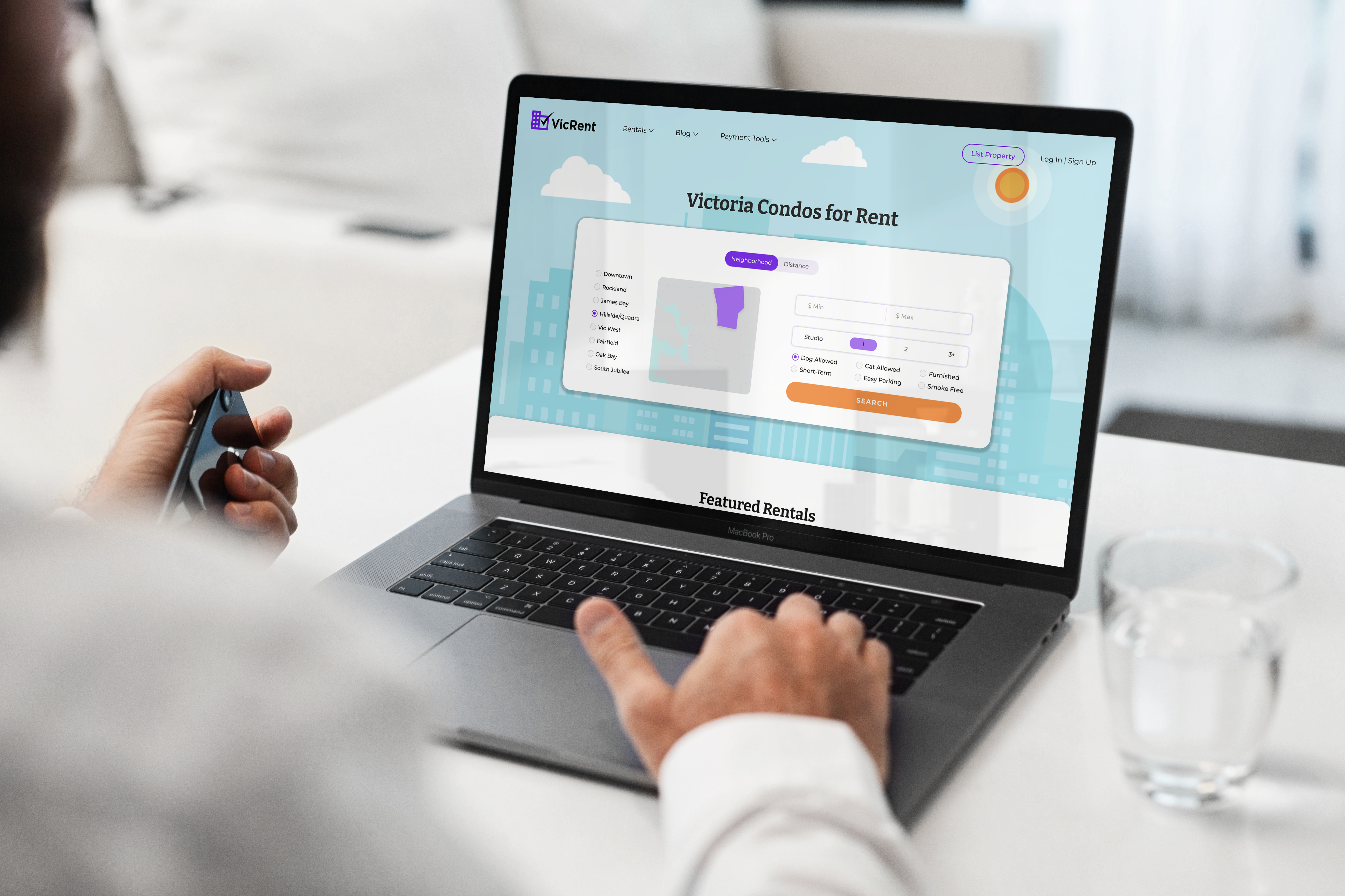
VicRentUI Design
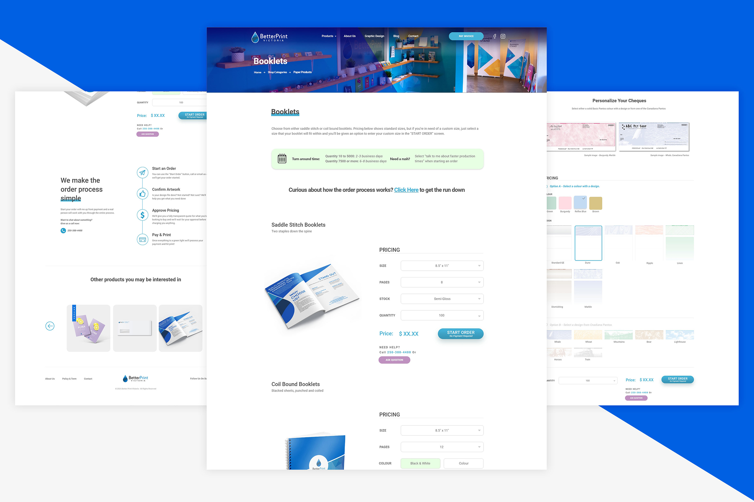
Better Print-Online ShopUX/UI, E-commerce Application
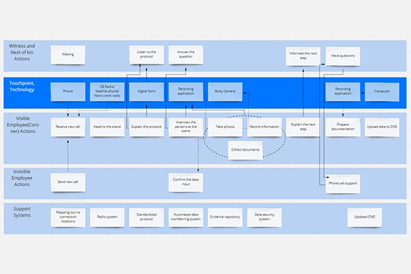
Service Design for CoronersService Design / UX for App
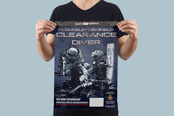
Royal NavyCommunication Design / Print,Signs
Pacific FCSports Design/Print, Digital, Social Media
Arnold Lim FilmsLogo Design
Better Print VictoriaBranding/Art Direction
©Vanessa Myeong 2022, Freelance Visual & UX designer, B.C., Canada. All rights reserved.
